Teaching Style à la Blackboard
January 25, 2015
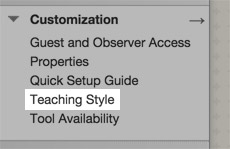
Computers are certainly a large part of the toolbox I use when constructing my classes. Of course there are other tools, like books, and charts, and demonstrations, and so forth. Yet, computers are probably the single largest component. The first time I built a course, I used the Learning Management System called WebCT. I think I posted pdfs of the powerpoint slides there. It was useful, but not elegant. My current institution uses the Blackboard LMS (which I guess bought WebCT so they’re really not much different). I don’t rely on Blackboard for much these days. I put a link on there to my own page, where all the course content resides. The reasons for that are numerous, but mostly because it’s easier and faster for me to do it that way. Tonight, I was setting up this link when I noticed another button on the Blackboard interface: “Teaching Style.” It was buried there underneath the customization tab.
How nice I thought. Maybe it would allow us to adjust our teaching style with a fancy slider control that ranges from ‘hardened and vengeful adult-infant’ to ‘docile amnesiac elderly aunt’, with the default being somewhere in the middle. Or perhaps, it would lead to a series of radio buttons that would offer choices like “caring” or “detached” or “obsessive” or “absent”. Or maybe even it would include a set of check boxes that we could use to select events or actions that will set us off when encountered during the semester. “Check here if you would like your head to literally explode when someone asks if they can use their phone on a test.”

How nice I thought. Maybe it would allow us to adjust our teaching style with a fancy slider control that ranges from ‘hardened and vengeful adult-infant’ to ‘docile amnesiac elderly aunt’, with the default being somewhere in the middle. Or perhaps, it would lead to a series of radio buttons that would offer choices like “caring” or “detached” or “obsessive” or “absent”. Or maybe even it would include a set of check boxes that we could use to select events or actions that will set us off when encountered during the semester. “Check here if you would like your head to literally explode when someone asks if they can use their phone on a test.”
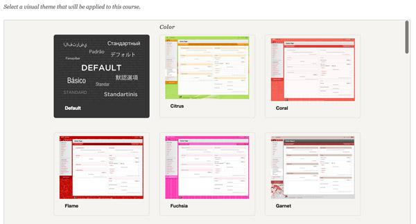
I ventured into the ‘teaching style’ menu and of course, it had nothing to do with what we might actually call teaching style. The options within allow the course manager to choose if the background theme would be inspired by ‘citrus’ fruits or ‘nature’ or even the ‘open source’ movement, cuz open source is cool and it says my class has an edge.


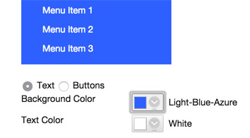
Further down in the ‘teaching style’ options was a place where one could upload a banner! Yay! That’s how you can be sure to differentiate your course and style of teaching from all the other hacks out there. Or change the background color of your dropdown menus. The choices were limitless. And by limitless, I mean limited. I’ll go with Light-Blue-Azure me thinks.

I’m guessing that on some marketing brochure that Blackboard mails to prospective universities that are looking to unload several millions worth of tuition or tax dollars on this rubbish, this option might enable them to say, while remaining within the bounds of some definition of truth, that they offer a wide variety of customizations that will adopt to all teaching styles. And, yes, that’s true, if by teaching style they’re referring to whether your background theme is ‘Coral’ or ‘Halloween’.
For those who might be drafting a ‘statement of teaching style’ or philosophy for a prospective job opening: I think you might be well advised to discuss these options — why, in the context of active learning, do you think your Blackboard menu dropdowns should or should not have rounded corners and beveled edges. What are the implications for creative growth of the student by choosing the ‘Pizzaz’ theme. Right to the top your essay shall go.
Share on: